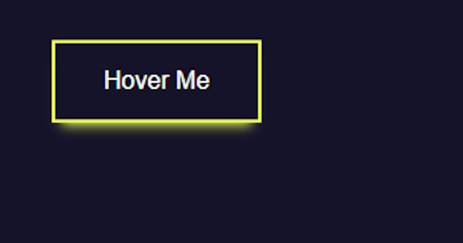
How to make a fancy button using pure CSS
Documenting my web dev journey, CSS part
Hello tech enthusiasts! I am back after a little break as I was unwell due to the season change. But in the meanwhile I dove into the beautiful and vast land of CSS. Yes, I learned about many different CSS properties and also learned how to make a fancy button which I will share with you all now :)
Lets Begin!
So, aim of this tutorial to teach you how to make a button with pure CSS on which when we hover we get a glowing indication that it is interactive and tbh it looks kinda cool.
Creating a static button first
Background: so, lets first remove the ugly default background of the button by first selecting the button with element selector and add background: none;
Border: Next, giving it a border: 2px solid and color to the whole button ( it could be any color of your choice ) , I gave it color: #ffa260; its a orangish color. Now the button should look something like this:

- Padding: Lets add some space inside the button ( padding ), padding: 1em 2em; and font size: 1em;

Static button is done, lets now move on to the hover Button
- Border-color: we want the border color to change on hover, something of your choice , I picked color #f1ff5c; it gives the yellowish glowy color lol and the inside text color to turn white on hover.

- Box-shadow: Now , for the glowing part we need to learn about box-shadow CSS property. To learn more about box shadow
This is the syntax for the box shadow we are going to apply.

For the x-offset, we dont need the shadow so we give 0 to that part.
For y-offset, we will apply 0.5em
Blur radius, we also apply 0.5em
- There's also a property called spread-radius, we dont need that so we keep it 0. But even after giving it 0, there is some default spread-radius and to lower that we need to apply negative spread-radius ( -0.4em ) in this case. And finally, the color of the box-shadow effect. same as the border #f1ff5c.
Transform: We want to make the button go upwards a little when we hover. This shows that the button is interactive. For that there is a property called Transform with attribute Translate ( which moves the element along the x or y axis ). We will make Transform: TranslateY(-0.24em); So, Y indicates that the element will move only in y-axis, and negative value so that the element move upwards. ( By default , positive value moves the element downwards in y-axis ).
Transition Everything is done now, except that when we hover at the button the transition is very quick and not clearly visible because of that. To slow down the transition, we have to apply the transition effect on the button. Write, transition: all 0.25s;
Extra To make the hover effect look more better we can change the default cursor to pointer by, cursor: pointer; in the hover.
This is the final code :

